TIMAVO HOUSE
The project is based on a desire to integrate new elements with an existing building, forming a morphologically and volumetrically completed unit able to dialogue with the surrounding architecture.
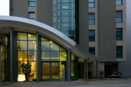
Starting with the features of the existing building, typical of 1950s Milanese architecture, the new architecture blends them with modern elements so as to establish a dialogue and a connection with the surrounding urban fabric, pursuing the principle that the work should be visible.
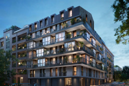
In the plans the project tidies the design of the existing facade with a rhythmic pattern of windows alternating with the windowless surfaces and the jutting balconies and loggias. The roof, which can be seen from the surrounding buildings, is regarded as a sort of “facade” and, for this reason, it has a jutting cornice that marks the building as separate and complete.
The decorative element of the facades consists of the existing cornice which is maintained and integrated in the volumetric design, becoming a point of demarcation between what existed before and the new part.
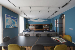
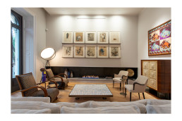
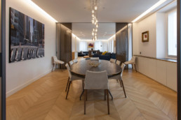
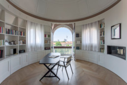
The principle of making the work visible is also seen in the choice of the cladding materials of acrylic stone panels which are smooth on the existing storeys and textured on the new parts, in neutral shades of beige-white. This same principle was adhered to in the choice of precious interior cladding which is identical to the that used in the existing building but which breaks the rules of tradition by being juxtaposed with modern elements, such as wainscoting with integrated lighting and wooden floors in warm hues, to create a comfortable and luxurious environment.
Structures
The added storeys are realised by an “exoskeleton” that surrounds the existing body of the building and is made up of a system of structural portals which support the new volume.
This structure is integrated in the volume of the building by the ventilated facade system that envelops the entire building. The new structure is only visible on the added stories. The element which marks the break between the two is the horizontal band which recalls the design of the existing cornice , the distinguishing mark of this building and a key to the various phases of the work.
This expedient enabled the project to transform major construction limits and planning restrictions into a design opportunity.
Systems
In a quest for energy efficiency, low environmental impact and elevated comfort of interiors the choice fell to geothermal energy and photovoltaic panels, radiant floor heating panels, home automation to control the electrical plants and CMV in the apartments ensuring filtered air free of pollutants, recycled heat and energy-savings.
Green
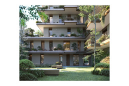
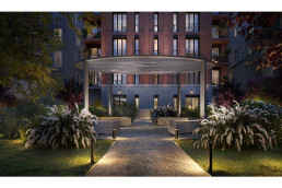
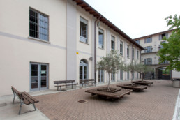
The focus was largely on the green element as this is of primary importance in generating a high quality environment. Indeed, the project contributes to determining the elements of the city landscape with its treatment of existing open spaces which are maintained as a link to the surrounding urban context. This is the reason why the garages are below street level, where the existing garage space has been expanded, mitigating the impact on the open space.
In that regard plans were drawn up to create two different scenarios:
• a daytime one where the garden is seen as space to play and relax surrounded by plants and shrubs
• a nighttime one where the light transforms the natural space and elements present.
FIELDResidentialNAMETimavo HouseCLIENTPrivateYEAR2019LOCATIONMilan, Italy

